Search

RIT Museum Studies

preparing museum professionals for the 21st century

Tag

Graphic Marks

Current RIT Logo (Mixed type)

RIT Logo with Tiger

This is one of the current official RIT logos in use. The design itself is a mixed-type logo, featuring the school’s initials as a lettermark and the sideview of a tiger as a logo. This particular example is the black and white version, there is a variant that is colorized with the official school colors. However, the most common version of this logo includes only the RIT lettermark, being featured on most official documents and other RIT publications.

Current RIT Seal

Unidentified RIT Logo

The current official RIT seal, which has the highly-limited use on official diplomas. This seal is incredibly similar to the RAMI seal of the 1930’s, featuring the same woman, shield, and slogan of “Art, Science, Industry.” Very minor changes have been made beyond the change in school name, primarily the border has been modified to exclude the most outer circle. The foundation date was also moved to below the logo rather than inside, and the font type changed to a bolder, sans-serif type.

RIT Graphic Mark Scarf

RITScarf

In 1973, RIT decided to update the “square-notch” logo. The logo was re-designed to consist of multiple lines that created the same square shape of the previous logo with the corner cut out. The new logo design allowed for the use of alternate colors beyond the orange and brown previously used in the Roger Remington logo. This scarf dates to the 1970s-80s.

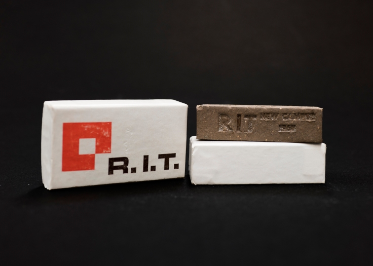
Miniature Souvenir RIT Brick 1968

SouvenirBrick

Numerous miniature bricks like this one were handed out to tours and students to celebrate the new Henrietta campus that RIT moved to in 1968. The brick itself was made of the same patented mixture that all other bricks at RIT are made of, making it an identical miniature of the 7.5 million bricks that were used to create the new campus. The packaging containing the brick featured the new RIT logo, making it one of the earlier souvenirs to display the newer logo as well as the new colors adopted by the school. The brick was created by Weckesser Brick Company; the logo on the box was designed by R. Roger Remington.

RIT Reporter Articles and Cartoon, November 1967

An update to the RIT logo was made during the summer of 1967. The logo itself was designed by R. Roger Remington and was considered a modern graphic mark that fit all the design requirements: it was easy to rescale, recognizable with alternate colors, and incredibly simple. Unfortunately, the “square-notch” logo was not well-received by students. An article featured in the November 3rd, 1967 issue of the RIT Reporter (upper left) criticized the change in logo for not including the students in the decision, stating that, “RIT is the student body; for without the students there would be no life at RIT.”

Apart from the update to the RIT graphic standards and identity manual, there was no official statement made explaining the symbolism behind the new logo design. RIT Reporter featured numerous political cartoons, such as the one pictured to the left, which scrutinized the unknown origin and design of the logo. There was motion made to repeal the new logo that reached the RIT Senate not long after the design’s initial adoption. The front-page article shown in the upper right and the continuation article to the right cover the results of the Senate hearing. Remington himself was present to defend the logo and made his case using other examples of logos within industry. With the design of the logo explained, the Senate turned down the repeal and Remington’s logo remained official, seeing continued use until its re-design in 1973.

Mary Anne Cross Ehasz’s Senior Banquet Mug

BanquetMug

Very small mug in stature, light tan colored with blue text on the front depicts the logo as well as “Senior Banquet, 1957.” The logo printed on the front is a reproduction of Mary Anne Cross’ logo which she designed before she graduated in 1956 with an A.A.S. Degree. This mug was given to Cross as a souvenir with a B.F.A Degree in 1957.

Hand painted RIT Official Seal 1956-1966

RIT Official Seal 1956-1966

This seal, designed by Mary Anne Cross-Ehasz, became RIT’s new logo in 1956. Mary Anne hand painted and designed this logo in three layers: the outer layer with lettering and a dark blue circle that reads “Rochester Institute of Technology: Rochester, N.Y.” Inside of that circle, a light blue square with the acronym RIT envelopes a white triangle. Although this design was a departure from previous logos, it retains an association with the past by including the founding date of the earliest institution from which RIT was born (The Rochester Athenaeum, 1829). With this logo, Mary Anne set a trend. She was the first designer to add the dots between each letter in the acronym RIT—a motif that is still in use. The back of this board contains the name of Alexander Lawson, the faculty adviser of Gamma Epsilon Tau, the collegiate honor fraternity for graphic artists.

Coat-of-Arms style symbols used by RIT for the year of 1948

World War II brought about an upsurge in American patriotism, and the RIT logo reflected this spirit. The school went through various logos during the war, most featuring an eagle, others featuring an industrial backdrop. An interesting variant of the RIT logo appeared later in 1948, one that took inspiration from coats-of-arms. This logo was used solely for the year of 1948, and the reason for the change is unknown. After 1948, RIT reverted to using the industrial-themed logo up until 1956.

RAMI Rectangular Symbol

Unidentified RAMI Logo

Sometime in the 1932-33 year, RAMI modernized its logo yet again. The woman returned with a face-lift, wearing a sleek and “modern” dress holding a large feather. A silhouette of factories appeared the background, representing the growing industrial movement occurring at the time. The most drastic change was the replacement of the circular border with a rectangular one, a possible influence from the Art Deco style of the 1930s. Like most RAMI logos, there were variations that were made over time. Some of the rectangular logos featured multiple women, also holding feathers, others were subtle changes to the woman’s appearance.

Create a free website or blog at WordPress.com.

Up ↑