Search

RIT Museum Studies

preparing museum professionals for the 21st century

Tag

Cartner

Just one more thing…

…the portfolio. I did it. I did the thing. I’m not gonna lie, I did it rather begrudgingly because the rest of the class felt more “hands-on” and this portfolio was more of a “sit here and write what you learned” kinda thing. With that said, it was nice to look back at all of the stuff we did over the semester (primarily the projects, of course). It’s nice to think that the exhibit I created for project 1 will actually be there, on display, for the public. Same goes for the others, all the digital instances on Drupal, Omeka, and WordPress are out there in the wild of the internet (SOON TO BE NOT-SO-WILD DUE TO THE FCC *end political rant*). The only thorn in this portfolio was finding or creating a visual for the readings, it’s kinda hard to visualize a non-neutral archive.

Also, shout out to whomever gets the Columbo reference.

Final Project Stuff

After slaving away, I have finished (in a sense, you’ll see) my latest project of creating a collection on my own, of which is on my obsession with military gear. My military surplus collection documents every piece of military surplus equipment and clothing I own, and I plan on continuing to update it with new additions of surplus gear. I started working with Omeka for this (found here), but I have ported all items over to my WordPress site (found here). All items were acquired legally and are legal to own (yes, even the grenades), and most were bought for cheap at thrift stores and flea markets, so you too can have an eclectic collection of random military gear.

20171214_195114

Hack the Archives

With the increasingly digital world that we live in, it comes as no surprise that museums and archives have started to join the ranks of digital resources available on the internet. The push for digitizing artifacts started almost at the same time as the internet, since the web as we know it was created with the express purpose of sharing scholarly information. Speaking of sharing, open-source has become quite the buzzword when it comes to software and other programs/applications, including the tools we’ve used in class for our online exhibitions and collections. Given the inherent sharing nature of the web (and the fact that the creator, Sir Tim Berners-Lee, made his idea patent-free and royalty-free so that anyone could use it), open-sourcing should be standard. A clear upside to open-source software is the customization, an aspect that many museums have picked up on. Museums and galleries, in order to spark stronger interest, require more unique interactions and design that aren’t possible in closed-source applications. So what do they do? They take, re-purpose, and modify things others have done with the program to make something unique yet functional. MoMA was taken over a few years back by an augmented reality exhibit that was both open-sourced (the app that was used) and crowd-sourced (the artwork itself). Sharing within museums and archives goes beyond the software itself. With APIs and public hosting, any and all data within a collection or archive can be accessed and, more importantly, reused by anyone for anything. I personally feel that this level of open sharing is the whole point of the web, it was created to share information, and the amount of artifacts housed in archives and collections represent a vast amount of information.

Current RIT Logo (Mixed type)

RIT Logo with Tiger

This is one of the current official RIT logos in use. The design itself is a mixed-type logo, featuring the school’s initials as a lettermark and the sideview of a tiger as a logo. This particular example is the black and white version, there is a variant that is colorized with the official school colors. However, the most common version of this logo includes only the RIT lettermark, being featured on most official documents and other RIT publications.

Current RIT Seal

Unidentified RIT Logo

The current official RIT seal, which has the highly-limited use on official diplomas. This seal is incredibly similar to the RAMI seal of the 1930’s, featuring the same woman, shield, and slogan of “Art, Science, Industry.” Very minor changes have been made beyond the change in school name, primarily the border has been modified to exclude the most outer circle. The foundation date was also moved to below the logo rather than inside, and the font type changed to a bolder, sans-serif type.

RIT Graphic Mark Scarf

RITScarf

In 1973, RIT decided to update the “square-notch” logo. The logo was re-designed to consist of multiple lines that created the same square shape of the previous logo with the corner cut out. The new logo design allowed for the use of alternate colors beyond the orange and brown previously used in the Roger Remington logo. This scarf dates to the 1970s-80s.

Miniature Souvenir RIT Brick 1968

SouvenirBrick

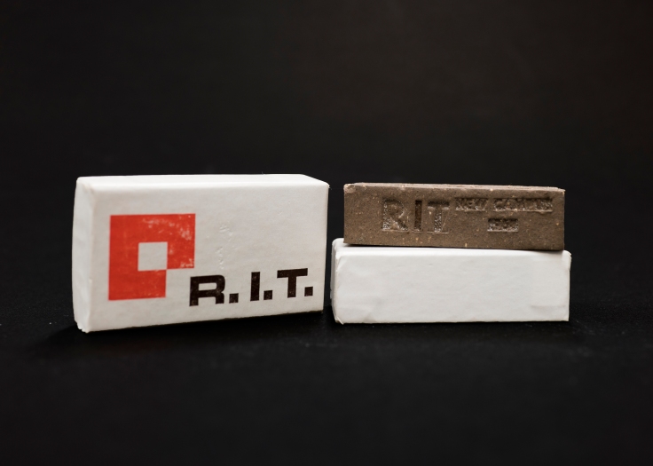
Numerous miniature bricks like this one were handed out to tours and students to celebrate the new Henrietta campus that RIT moved to in 1968. The brick itself was made of the same patented mixture that all other bricks at RIT are made of, making it an identical miniature of the 7.5 million bricks that were used to create the new campus. The packaging containing the brick featured the new RIT logo, making it one of the earlier souvenirs to display the newer logo as well as the new colors adopted by the school. The brick was created by Weckesser Brick Company; the logo on the box was designed by R. Roger Remington.

RIT Reporter Articles and Cartoon, November 1967

An update to the RIT logo was made during the summer of 1967. The logo itself was designed by R. Roger Remington and was considered a modern graphic mark that fit all the design requirements: it was easy to rescale, recognizable with alternate colors, and incredibly simple. Unfortunately, the “square-notch” logo was not well-received by students. An article featured in the November 3rd, 1967 issue of the RIT Reporter (upper left) criticized the change in logo for not including the students in the decision, stating that, “RIT is the student body; for without the students there would be no life at RIT.”

Apart from the update to the RIT graphic standards and identity manual, there was no official statement made explaining the symbolism behind the new logo design. RIT Reporter featured numerous political cartoons, such as the one pictured to the left, which scrutinized the unknown origin and design of the logo. There was motion made to repeal the new logo that reached the RIT Senate not long after the design’s initial adoption. The front-page article shown in the upper right and the continuation article to the right cover the results of the Senate hearing. Remington himself was present to defend the logo and made his case using other examples of logos within industry. With the design of the logo explained, the Senate turned down the repeal and Remington’s logo remained official, seeing continued use until its re-design in 1973.

Mary Anne Cross Ehasz’s Senior Banquet Mug

BanquetMug

Very small mug in stature, light tan colored with blue text on the front depicts the logo as well as “Senior Banquet, 1957.” The logo printed on the front is a reproduction of Mary Anne Cross’ logo which she designed before she graduated in 1956 with an A.A.S. Degree. This mug was given to Cross as a souvenir with a B.F.A Degree in 1957.

Blog at WordPress.com.

Up ↑